SUBCULTURE

Fred Perry, Squared

August 2023
Words by Paul Gorman

From tennis nets to chequerboards, how the humble square makes up the building blocks of our 2023 collections.

It’s easy to underestimate the power of the square, so simple and familiar are its proportions. But it’s worth noting that, with the circle and the triangle, the square forms the basis of so-called ‘Sacred Geometry’, the three shapes which are believed to dictate life itself.

These basic forms are agreed to determine art, architecture and design, for example, and, given its structure, it is fitting that the square is symbolised by four constituent parts: stability, strong foundations, order and the fixed nature of matter. It follows that grids and squares provide the framework within which sports and game-playing exists, from football pitches to tennis nets to checkerboards.
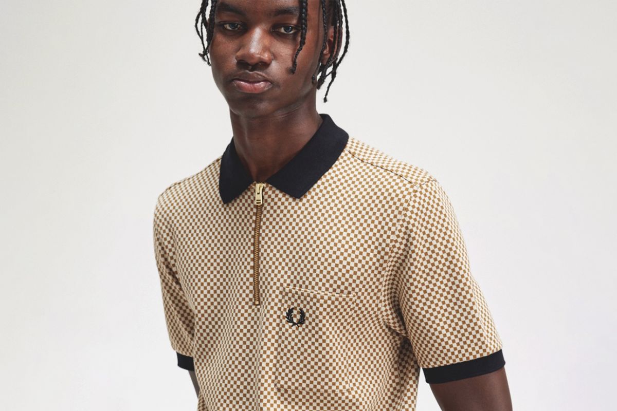
Meanwhile such geometric arrangements have long been a feature of subcultural aesthetics, in particular the clean lines and disciplined styles as expressed down the decades from Modernism through Mod, Suedehead and 2 Tone where fashion and visual identity emphasises smartness, meticulous construction and perfectly-realised detailing.

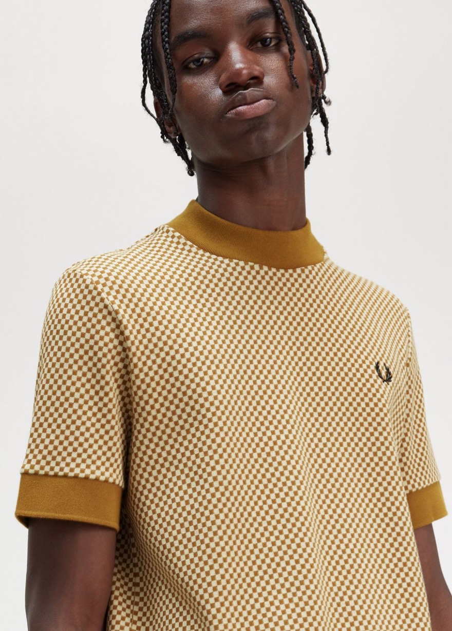
And where sport and subcultures meet, the sharpness of Fred Perry style is located.  Such patterns play a prominent part in the brand’s visual identity, from the graphics used for gig events to the use of alternating square piping, the lining in certain outerwear, the contemporary colourways of the classic check shirts and panelling on the classic 5-4-4 Polo Shirt.

Now, our latest collection, which has been developed by the design team with Head of Creative John Tate, updates such usages by adopting a range of geometric concerns that provide immediacy of impact without relying on past associations.

In fact, John was initially inspired by an early 2000s digital camouflage print top he discovered during one of his regular deep dives into the Fred Perry archive.

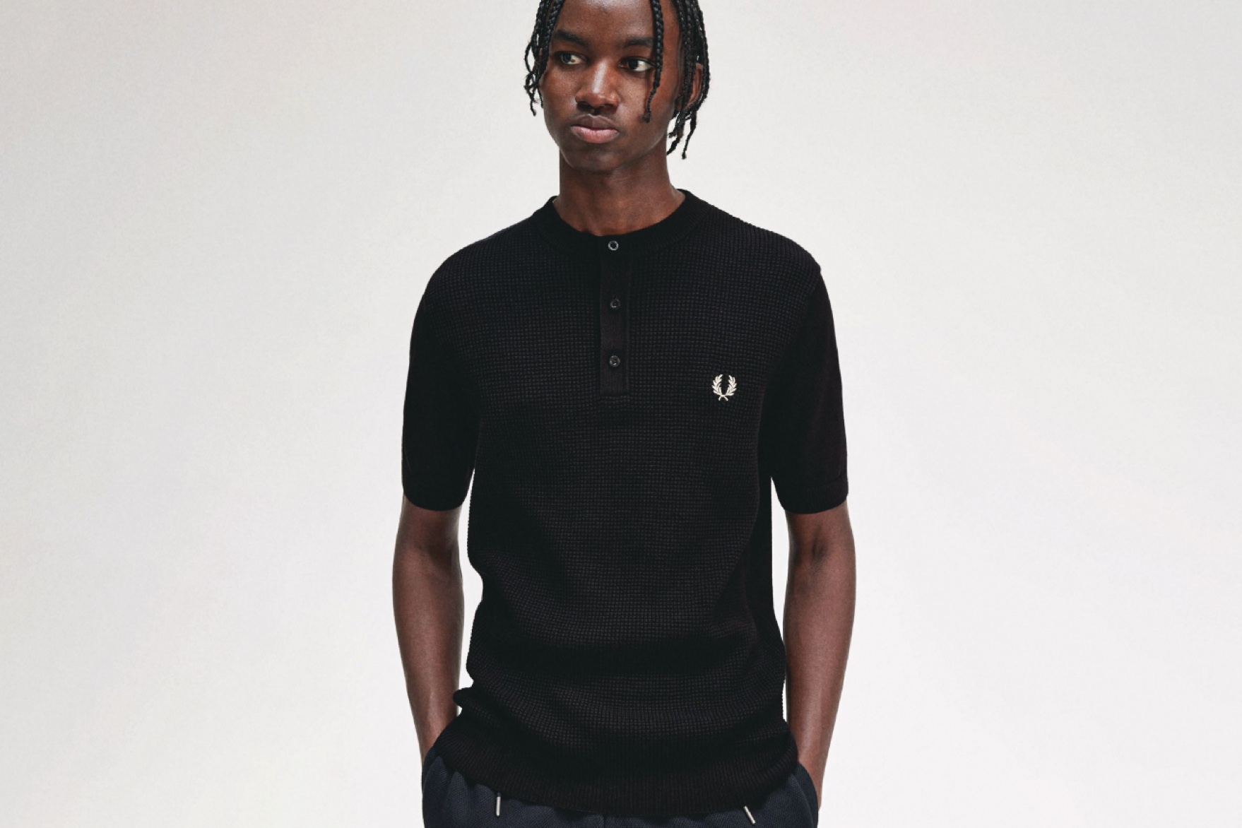
‘It was a light-bulb moment when I came across it,’ says John. ‘Immediately I saw that it spoke to the now, with the allusions to the digital world of pixels, glitches and interference.  Soon I realised it would make a fantastic starting point for using the motif of squares in a variety of ways across a new collection. Because squares create subtle yet obvious reference points, they have a visual language of their own, and me and the team looked into the ways in which we could not only apply them to prints but also to textures in fabrics such as waffle cord and knits.’

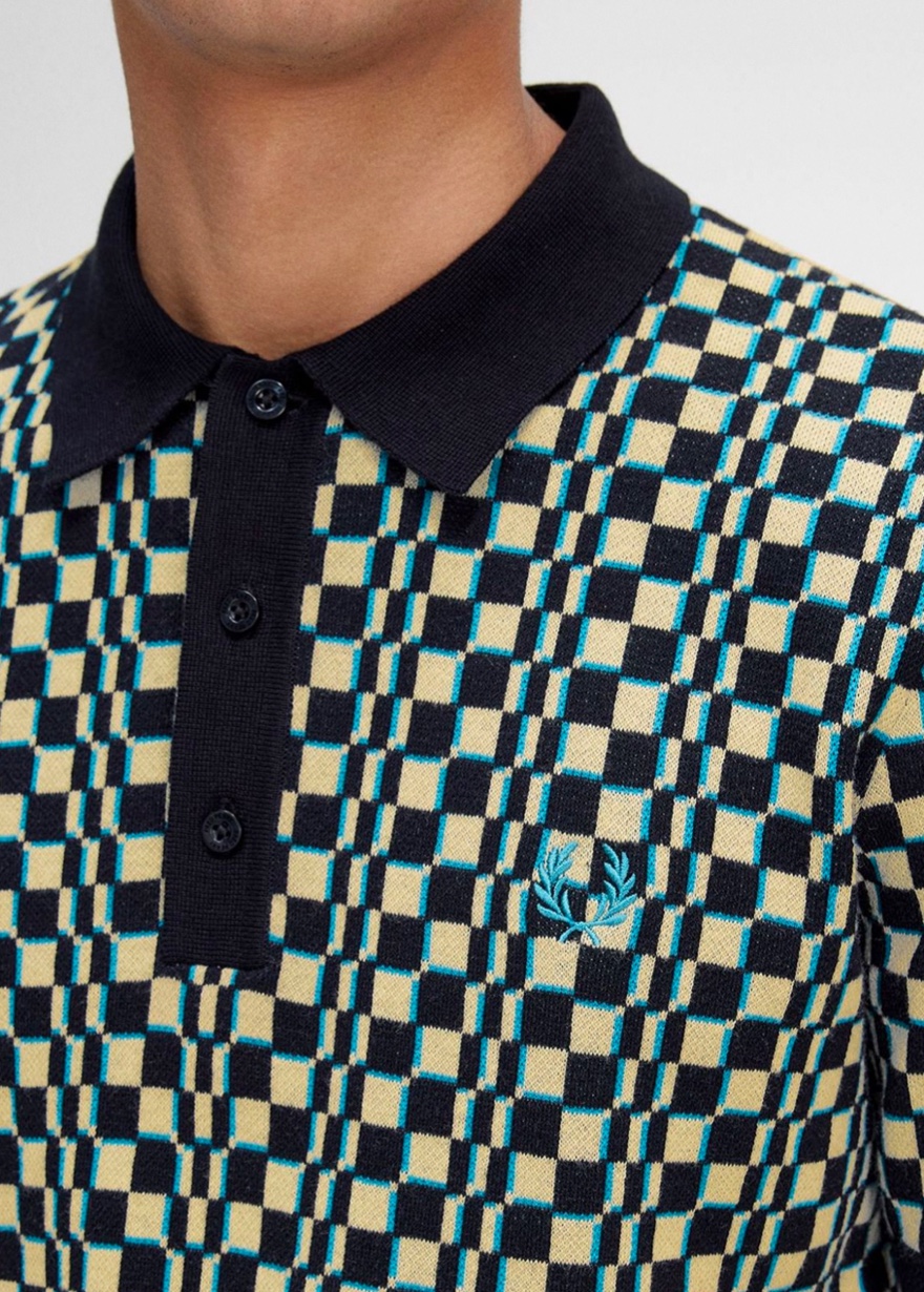
As a result, the new collection features a quarter-knitted Revere-collar shirt and the staple knitted short sleeve top as well as waffle jackets and broad square print sweaters. Even the hallmark Laurel Wreath is rendered as a gridded pattern in one design, while the digital camo print which triggered the story is reissued in updated form.

And the contemporary nature of the new collection is asserted by the deliberately contemporary use of checkerboard, which departs from predictable Ska-associated applications and fizzes with kinetic energy in such colour combinations as yellow and cream in sleeve piping.

‘This collection is thoroughly modern and glitchy,’ emphasises John. ‘We’re creating clothes which emanate visual interference.’

Now that’s sacred.


Discover our chequerboard edit here